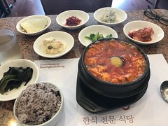
More off-Friday explorations of Koreatown, today at SeongBukDong. This bubbling cauldron is yachae soondubu, soft tofu soup with veggies, 🌶 🌶, and an egg for richness. Served with a lovely array of banchan (little dishes of pickled turnips, cabbage, greens, and other veggies). The spice-heat is selectable, and I braved “medium” which I enjoyed with some tears and sweat. I was the only non-Korean in the place - love that.
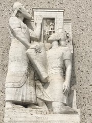
After lunch in Koreatown, today’s off-Friday adventure took me to check out the new Marciano Art Foundation on Wilshire. Maurice and Paul Marciano, the brothers who founded the Guess clothing business, were avid supporters of the contemporary art scene in Los Angeles, and wanted to share their collection with the public. They bought the old Scottish Rite Masonic Temple on Wilshire, which was basically abandoned since 1994, and have repurposed it as a modern art museum while preserving features of the historic building. Before going inside, I wandered around the outside of the building, a mostly windowless giant travertine box adorned with enough mysterious Masonic symbology to inspire Dan Brown’s next Robert Langdon novel. A series of monumental travertine sculptures depict a curiously diverse set of figures including Imhotep, Zerubabel, Hiram, the “Saints John”, someone “de Reims”, Christopher Wren, and George Washington. A giant mosaic mural depicts the history of temple building, with an equally curious selection of cities starting with Jerusalem, Babylon, Acre, and Rome, and ending with Boston and Sacramento. (Sacramento? Apparently the first Grand Lodge in California was established there in 1850.) The building was constructed in 1961, designed by artist and architect (and Mason) Millard Sheets, who was famous for his mosaic murals including many Home Savings bank buildings throughout southern California.
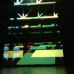
Inside the building, the many large spaces of the old temple have been nicely repurposed for display of the Marcianos’ collection and other exhibitions, many of which are quite large and need this kind of space. On the first floor, the cavernous hall that used to be the theater has been given over to a special exhibition called Reality Projector. Artist Olafur Eliasson designed this dynamic work specifically for this space. The vast three-story hall is empty like a warehouse, with concrete floors and exposed steel rafters, and is dark when you enter, illuminated only by the projection of abstract shapes in primary colors on the far wall. The shapes slowly move across the wall, intersecting each other in a way that gives depth in the sense that some shapes seem to be in front of or behind others, and the shapes are transiently obscured by large moving shadows. The projected light intentionally hits the exposed rafters as well, using them as a fragmented, layered screen. You’re invited to sit on a bench in the back of the room, or wander into the middle, or just drop down on the concrete and sit or lie down and watch this oddly fascinating light show pass by, like clouds on a windy day, if the clouds were painted by Ellsworth Kelly or Piet Mondrian. All of this is accompanied by a soundtrack of indistinct ambient noises and sounds. The combinations of shapes and colors seemed random and non-repeating, and I actually stayed in there a fair while, and revisited later on an upper mezzanine overlook.
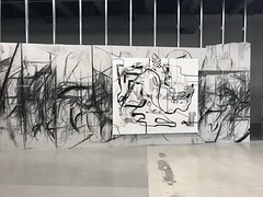
On the second floor is another special exhibition called “Line Packers”, featuring the work of two German artists, Peppi Botrop (1986-) and Albert Oehlen (1954-). Botrop, who hails from the Ruhr region of Germany (picture an old coal and steel industrial area, something like the German equivalent of Allentown, Pennsylvania), made a series of works alluding to those roots, using large slabs of Fermacell (an industrial material used like sheetrock in institutional buildings), charcoal to make dark visceral lines, and then carving and scraping the sheetrock. Oehlen, beginning in 1992, created a series of works exploring the possibilities of computer drawing, with sheets of black on white graphics printed from a Texas Instruments computer, lightly enhanced with black paint. Multi-artist exhibitions will often talk about the “dialog” between works of different artists exhibited adjacent to each other. But here, they’ve done something I’d never seen before: they created an actual mash-up of these two artists’ works, displaying them on top of each other, in a way that invites not only comparison but a contemplation of relationship and visual continuity between these two artists of different generations.
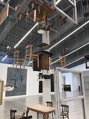
On the third floor is the permanent collection of the Marciano Foundation, mostly paintings with a few sculptures, with a large well-lit space suiting the large scale of most of the works. Many of the works are quite abstract, explorations of texture as much as color and shape. One artist, Jennifer Guidi, has a series made of paint mixed with sand that she could layer on the canvas thickly, and then poke, scrape, and mound up in interesting ways. The sort of works that you want to regard from a distance for their visual impression, and then look at up close and from the side to admire the technique. Then there are other works that are a bit more representational, or at least symbolic. Two giant works by Lari Pittman are filled with bold colors and a fascinating medley of recognizable forms and really good Rorschach tests that made me want to figure out what all is going on in them. Another large mural by George Condo seems at first just to be a bunch of lines, until as you look, more and more organic shapes – eyes, teeth, arms, coats and ties – begin to emerge from the apparent chaos. Perhaps my favorite work was a large sculpture in the center of the large main gallery that was essentially a bunch of furniture and home goods suspended in air by wires. The playful Architecture Without Architects by Damián Ortega is like a CAT scan of a multistory apartment building. Imagine three apartments, one above the other, with all of the walls, floors, and ceilings removed, but all of the furniture, lights, and stuff magically floating in place. Doors float without their door frames, with doormats floating in front of them, and perhaps a pair of shoes on a mat. Paintings float as if hung on invisible walls. Flowers in vases, glasses of water, and cigarettes in ashtrays rest on tables floating in space. I found it amusing and fascinating.
The mezzanine, between the ground and “second” floor, is also worth a stop. That’s where I found the balcony overlook for a second look with a new perspective at the Reality Projector light show. There’s also a fun mural along all four sides of the atrium lobby by Alex Israel, celebrating the streets and sidewalks of Los Angeles, with all sorts of native plants befitting an atrium, but also parking meters, newsstands, street signs, and other urban ephemera. It’s charming. The other thing worth a peek on this level is the library, where they have a bunch of artifacts from the Masonic temple on display, including the funny hats, costumes, and more mysterious symbology.
This exciting new addition to the LA art museum scene is open Wed-Sun. Admission is free and the parking is free too (check that out, Getty Foundation!), but you should reserve a timeslot by getting a free ticket on their website. Line Packers is on display through June, and Reality Projector through August. Check it out! (See full album of photos here.)
Friday, March 09, 2018
Subscribe to:
Post Comments (Atom)

No comments:
Post a Comment